I changed a few things on Chexed.com last night. The logo and the footer to be specific. The snazzyness of Chexed.com is now multiplied.
The Footer: MyBlogLog VS BlogCatalog
The bottom portion of Chexed.com was taking an unfortunate time to load, puppies were sad. So I wanted to cut down on a few things. I want Chexed.com loading as fast as possible.
I want to help people to be able to find Chexed.com and BlogCatalog has been making it easier for people and puppies alike to to find Chexed.com, based on the fact that more are visiting Chexed.com from BlogCatalog. So it seemed obvious to remove MyBlogLog over BlogCatalog.
The Logo: Stirring The Soup!
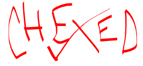
Since I was changing things around a little, I decided to make a new logo :) I like to make many logos and change them up often, sometimes back to old ones, sometimes to new ones. I like having that little bit of change to keep the soup stirring, so to speak. We don't want Chexed.com to stick to the edges of the pot, now do we? Of course not. We must keep stirring for our tasty soup! If you haven't noticed, I enjoy making analogies, it helps me realize how similar things are. Just like you must keep pooping, so Chexed.com must keep emptying out things that are stopping it up to.
From this:

To This Calligraphy Version:

SNAZZY! SNAP INTO A CHEXED LOGO! (<-- Click)
Do you like the red Calligraphy style logo? I made it using a free Adobe Illustrator alternative, Inkscape. I will probably be changing it in a few months, weeks, or days, but you can check out previous logos in the logo bin if you're feeling curious.
YouTube Video of the Moment: Portuguese Curiosity
|